Current Issues With Early Adopters Website
Early Adopter gave me a site spec sheet that included the project synopsis, the problems with their current website, competitors websites, and site requirements.
Early Adopter’s website design seems dated.
Early Adopter’s website does not show their updated products
It seems to be unclear on their current website who Early Adopters Partners are.
Their current website doesn’t show the projects they are currently working on.
Early Adopters current website doesn’t show their brand identity very well.
Research
I wanted to learn more about what Early Adopter was looking for in a website re-design, so I came up with several questions based off of the site spec.
Key Research Findings
In my research, I found that Early Adopter wanted a website that has an interactive home-screen that will immediately grab the users attention. They also want the home-screen to show who Early Adopter is and what they do without overloading the user with too much information.
Approach
Early Adopter had some ideas for how they wanted their home-screen to look. I was given three concepts and created a design for each of them.
Create a homepage that has similar imagery to the Connections project (a project that one of Early Adopters partners made) using VR (Virtual Reality) terms.
Make a periodic table with VR (virtual Reality) terms.
Create an alphabet/definition design using VR (virtual Reality) terms
One of these designs would become the face for Early Adopter’s new interactive home-screen.
Ideation and Development
While sketching out my designs I had to keep in mind what is the most effective way to show virtual reality terms and definitions for each of these designs.


Chosen Design
I changed the design from having one big Concept Web to having several Concept Web branches but still keeping the original idea of having VR (virtual reality) terms and definitions the user can interact with. The original design wasn’t responsive and won’t display nicely on a phone screen.
Design Challenge
Will this new version of the concept web fit and look good on a phone screen? NO
Webpage Designs And Sketches


I Sketched out the different webpages for Early Adopters new website. Since I was able to go through Early Adopter’s competitors websites with them during the research phase it really helped me focus on features they would really like to have in their own site.
Features
Interactive Home Page that teaches Users what Virtual Reality is and Who Early Adopter is
Easily able to go to the products website from their own site
Show all the Projects Early Adopter is working on with their different partners
Products Page
Problems
1. Early Adopter’s website does not show their updated products
2. Products don’t link out to external product/partnership sites (VRQuest, Chilzone, Chronoquest).
Solutions
I created a Products Page for Early Adopter so they can list all their products since their original website lacked a products Page.
The products Page also allows users to go to the external products/Partnership sites (VRQuest, ChronoQuest, Chilzone) where you can learn more about the products.
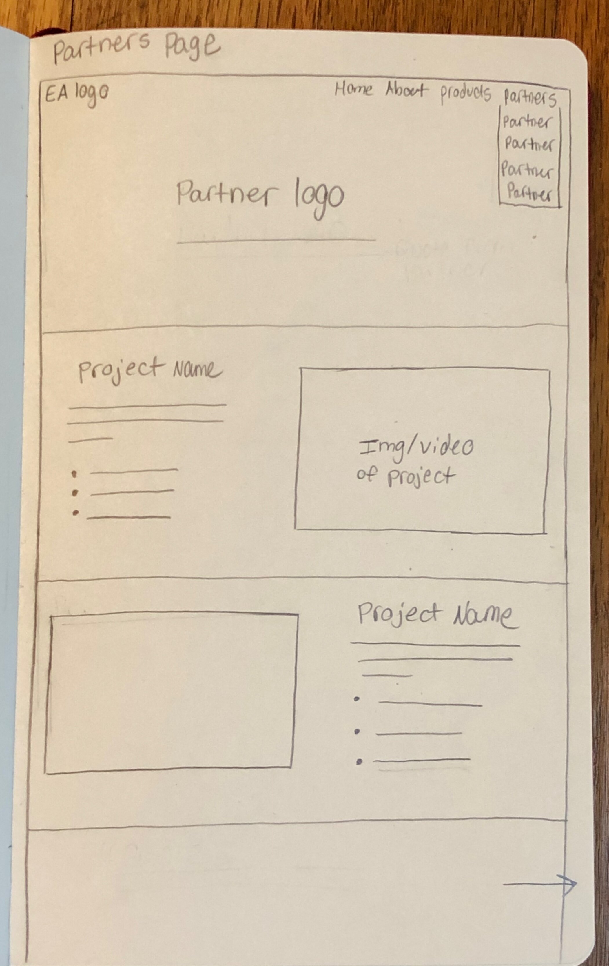
Partners Page
Problem
3. It seems to be unclear on their current website who Early Adopters Partners are.
Solutions
I created a drop down menu when the user hovers on Partners in the nav to easily see who all of Early Adopters Partners are.
When the user clicks on one of the partners they’ll be brought to a webpage where they’ll easily be able to see and read about all the projects and products Early Adopter is working on with that partner.
HomePage
Problems
1. Early Adopter’s website design seems dated.
5. Early Adopters current website doesn’t show their brand identity very well.
Solutions
I gave Early Adopter’s website an updated look by adding more white space, taking away text, and giving them a brand identity.
Reflection
I learned a lot about the designing for a team of people at this internship. Before having this internship I was the only person who had to be happy with my designs for my school and independent projects.There was a lot of brainstorming and trial and error to come up with a website design that the whole team at Early Adopter would be happy with. The most important thing I learned at this internship was it’s more important to come up with several sketches of possible website designs rather then one or two polished website designs.


