Many young adults have a tough time saving money. Money Saver is an app that allows the user to control what they want to save for and how they want to save their money while still being able to pay their daily expenses.
Problem
Many young adults have a hard time balancing money when they are first on their own. They either have a hard time saving money for things they want to buy or do, like go on a vacation, or they end up having to use the money they’re saving to pay bills and daily expenses and afterwards don’t have enough money left over to do them.
Solution
With the app Money Saver users can choose three objects or activities they would like to save up for like a new computer or a vacation. Users can easily set money saving rules to help them save money and also be able to easily see their savings progress. This will help users save money and ease their stress about spending money on objects or experiences that aren’t part of daily living expenses.
Design Challenge
There are many budget saving apps out their; however, what would make my app unique compared to the rest? This made me question;
Which type of users relied heavily on budgeting and saving money in their daily lifestyle?
Research
I wanted to understand why many young adults have a hard time saving money and how they decide when they should treat themselves to that new video game console or that vacation. How could Money Saver benefit their spending and saving lifestyle? My questions were answered by asking young adults (ages 21-26) questions about their spending habits and saving habits.
Analyzing these pain points; I’ve come up with goals on what Money Saver had the potential to develop:
Money Saver’s Solutions
Tracks how much money you have saved and how much more you need to save for the object or experience you choose to save up for
User can set up money saving rules to save money on their schedule
Personalize what you want to save up for
Ideation and Development
Sketches of Home screen, Autosave Rules, creating autosave rules screens, and possibible icons that will be used
Focusing on tackling the pain points above I sketched out my ideas into low fidelity wire frames
Sketch of Autosave screen and the screen that displays all the details of a specific autosave rule the user has created
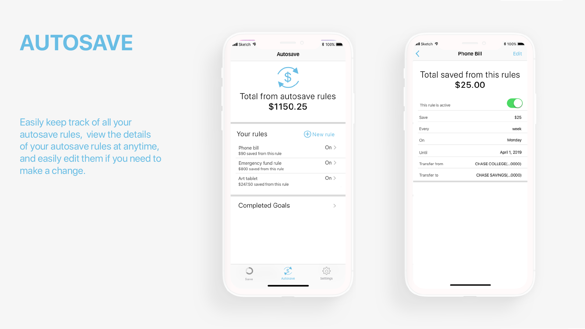
I wanted users to have an easy way to view the details of their autosave rules whenever they like and also be able to edit their rules or turn them on or off anytime they please. I decided listing all the autosave rule information on one screen as well as being able to edit or turn on/off autosave rules. Flipping back and forth between multiple screens to turn on/off a rule or to view multiple pieces of information for the same rule seemed very time consuming and unecessary.
Final design of Autosave screen and the screen that displays all of an autosave rules information if the user clicks a specific autosave rule. The user above has clicked on the Phone bill rule
Original sketch of how to add savings rings (left) sketch of new idea for Add Savings Rings screen after getting feedback on my original design (right)
Design Challenge
My original design for adding savings rings was found confusing becasue of how text heavy it was. The design also made it look like you had to create all three savings rings at once which was a problem.
sketch of new idea for Add Savings Rings screen after getting feedback on my original design
Design Solution
I decided to make the process of adding savings rings into a two screen process so it looked less text heavy. It also made it less confusing when users wanted to add savings rings because they weren’t overwhelmed by the amount of text and were able to now easily tell that they didn’t have to add all three savings rings at the same time if they don’t want to. They could add just one or two savings rings if they didn’t have three items they wanted to save up for.
Branding
Branding includes the typeface I used, the apps color palette, and the logo you would find on a smart phone’s home screen
I went with the typeface SF Pro Display Apple’s typeface for apps because it is easy to read and comes in a variety of weights. I wanted the colors to be bold enough that you could easily tell the three savings rings apart from each other.
For my app icon I included one of the savings rings because they are the main focus of the app and included a dollar sign in the center so users would know this app is about money.
Outcome
Project Money Saver is designed to help young adults save money for objects or events they want like a new TV or a vacation while still being able to pay for their daily expenses. Here’s Money Saver in action.
Reflection
I enjoyed working on this project even though I did run into several design issues. I had to re-design several parts of my app because the flow of how to use the app didn’t make sense. I am proud of how much I learned doing this project. I am happy with how this project came out and will continue to keep pushing this project further.


